
In today’s digital age, ensuring that your website performs well across all devices is crucial for online success.(RWD) has become a key strategy for creating websites that adapt seamlessly to different screen sizes and devices. By implementing RWD, you enhance user experience, improve SEO performance, and increase mobile traffic. This approach helps your site rank higher in search engine results, provides a consistent experience on smartphones, tablets, and desktops, and reduces the need for multiple versions of your site. Embracing responsive web design is essential for optimizing your online presence and boosting your business’s success.
What is Responsive Web Design?
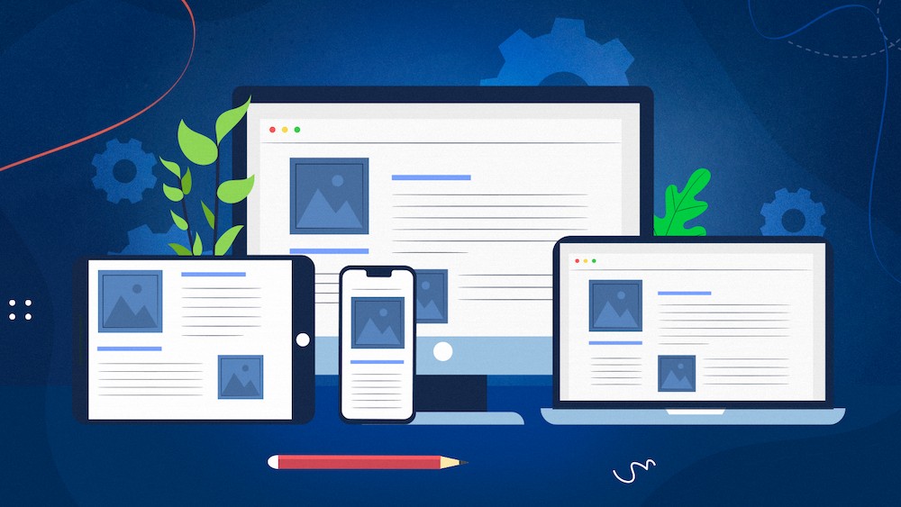
Responsive web designing is a web development approach that ensures your website’s layout and content automatically adapt to fit various screen sizes, from desktop monitors to mobile phones. Utilizing flexible grids, responsive images, and CSS media queries, this technique guarantees an optimal viewing experience on any device. By implementing responsive design, you enhance usability, boost seo ranking, and cater to the growing number of mobile users, ensuring your site performs well across all platforms.
Key Benefits of Responsive Web Design
Responsive web design delivers numerous advantages that can significantly impact your website’s success . It ensures your site looks and functions well on all devices, from smartphones to desktops, enhancing user experience and engagement. Improved SEO rankings are a direct benefit, as search engines prioritize mobile-friendly websites. Additionally, responsive design reduces maintenance costs by eliminating the need for multiple site versions and adapts seamlessly to new devices and screen sizes. Embracing responsive design is essential for optimizing your site’s performance and staying ahead in the digital landscape.
1. Improved User Experience
A responsive website offers a consistent and user-friendly experience across all devices. Whether your visitors are using a smartphone, tablet, or desktop, they will enjoy a well-organized layout that’s easy to navigate. This enhances user satisfaction and reduces bounce rates.
2. Increased Mobile Traffic
With the growing number of users accessing websites from mobile devices, having a mobile-friendly design is crucial. Responsive design ensures that your website looks and functions well on all devices, making it easier for mobile users to engage with your content.
3. Cost-Effective
Maintaining a separate mobile site and a desktop site can be costly and time-consuming. A responsive design eliminates the need for multiple versions of your site, reducing development and maintenance costs. You only need to manage one website that works across all devices.
4. Better SEO Performance
Search engines, like Google, prioritize mobile-friendly websites in their search rankings. A responsive website improves your chances of ranking higher in search engine results pages (SERP’s) because it provides a better user experience and avoids duplicate content issues associated with separate mobile sites.
5. Faster Load Times
Responsive design often leads to faster load times due to optimized images and streamlined code. Faster loading improves user experience and can positively impact your search engine rankings, as site speed is a critical factor in SEO.
6. Easier Analytics and Tracking
Tracking user behavior across different devices can be challenging with separate sites. A responsive design simplifies analytics by providing a single, cohesive view of how users interact with your site, making it easier to analyze and optimize your marketing strategies.
7. Future-Proofing
As new devices and screen sizes continue to emerge, responsive web design ensures that your site remains compatible with future technology. This adaptability protects your investment and keeps your website relevant for years to come.
Read more:Why is Responsive Design So Important?
Conclusion
Responsive web design is essential for creating a seamless, user-friendly experience across all devices. By adopting a responsive approach, you can improve user satisfaction, enhance your SEO performance, and reduce development costs. Embrace responsive design to ensure your website is well-equipped to meet the needs of today’s diverse and mobile-centric audience.
Read our latest Blog:How to Choose the Right AI Model for Your Application.